Growing Your Business 101
To get the most out a design, is it best to fill every square inch?
We are often asked by clients to use up all the space in a design. For example a 1 page flyer, we may be asked to fill every inch of it with products or offers from the client.
I understand why we are often asked to do this. As the business owner, you want to get the most out of your advertising. If you are paying for a full page, you are determined to get 1 page and not a square inch less. One attempt to getting the most bang for your buck is to fill that page with as much as you can possibly fit on the sheet. But are you really getting the most out of space by doing that?
The best way to look at this may be thru an example. I am going to show you two ads below. I want you to take a quick 1 second glance at each and then .. quickly move on to the next step. This is important, because that is what a potential viewer will do. 1 Second, and flip the page.
Step 1: Glance over the following two ads spending no more than a second on each.
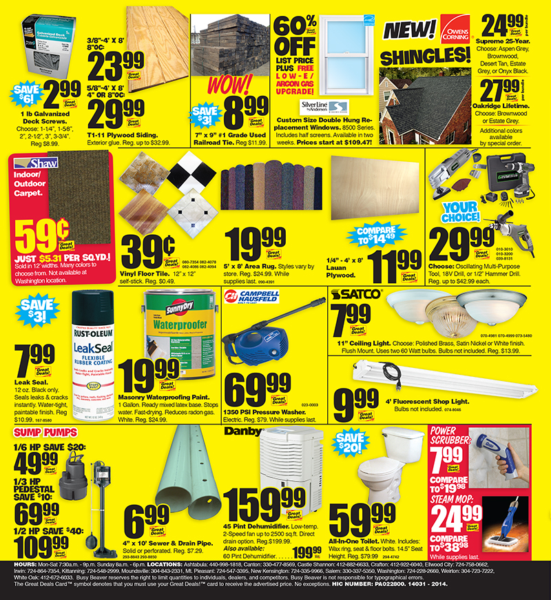
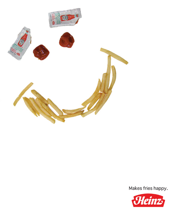
Step 2:
Ok. now, close your eyes for a minute and try to remember as much as you can from each of the ads. If you are like me, you might want to grab a piece of paper and write down any details you recall. Do you notice anything unexpected here? If you did this exercise correctly, you may be surprised to find that you remember more from the ad with hardly anything in it. How odd is that.. The ad with a ton of great things to say, most people will not remember anything from! The ad with hardly anything in it, is somehow the one you remember.
Sometimes this kind of exercise is hard to do via a website because it is important to give each ad equal time, and that each only be viewed by itself. But hopefully, you were able to at least experience some of the effect. This is an important concept to understand, and not something you would take lightly if you want to get better results from your marketing efforts.
We've all heard the phrase - Less is more. Well when it comes to marketing and advertising, this phrase should be plastered across every decisions you make. As an effective business owner, learn to see past the first instinct to fill ad space. Instead learn to put yourself in the customer's shoes.. or better yet.. learn to see thru your customer's eyes. They do not see what you see as the business owner. They only notice simple, clear, concise points that are made in big clear open space without clutter.
In a world full of clutter and information overload.. lean toward simplicity, toward saying less. You will actually end up being heard more. Your customers will begin to notice your marketing and for a brief moment, your ad will have their attention. At that moment, you can convey your main message. And this brings me to lesson number 2 that I want you to remember with this type of design approach: Convey only 1 MAIN key message. It is tempting to try to tell the customer everything your business does well, but try your utmost to pick 1 main point per design. If you are creating a flyer, you should ideally have only 1 point that it tries to communicate. At most, you can deliver a maximum of 2 points if the flyer is double sided. That lets you break up two points and you might catch their attention with either the front or back. If you know they are going to always see side 1 first, ( for example the cover of a brochure), then open with 1 key point, and then providing supporting info related to that same key point when the user turns the page. If you grabbed the audience by stating your service is unmatched by anyone on the planet, you should then support that with related details once the customer reads further, or turns the page. You don't want to instead try to follow with a second lead point such as we also have more selection of shoes and ties than anyone. That is not what got the audience interested and not what they want to hear more about. Always think from your audiences' point of view. They will thank you for it with increased business.
Limiting your communication to 1 main point will help you achieve the above goal of less is more. 1 point is easier to make short, simple, and clutter free. This means it will easier for your audience to see, easier to understand, and easier to remember. That is how you get more out of a design...by saying less.
Tell us your thoughts and what you would like to learn more about. Our goal is to help you grow your business thru intelligent design rather than guesswork.
Browse Products
Business Card
Website
Tri Fold Brochure
Flyer

Postcard

Letterhead
Envelope
Custom Logo

Half Fold Brochure

Poster
Twitter Facebook Cover
Sign
Doorhanger
Presentation Folders
